
What are the properties of the different kinds of pen nibs?
Lettering nibs (Round Hand nibs)
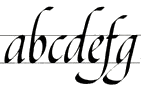
 Lettering nibs are most commonly used for artistic scripts found in books. The stroke width varies depending on the direction in which the nib is drawn. Lettering nibs are available in different widths for different character sizes.

The stroke width automatically changes by moving the nib in different directions.
 The thin lines at the beginning or the end of a letter are created by turning the nib on its edge while writing.
 Italic letters are written with the round hand pen.
▪ You can find alphabets written with lettering pens here.
▪ You can find instructions how to use lettering pens here.
▪ You can find a wide range of lettering pens here.
Poster Pens
 The function of poster pens is the same as that of lettering nibs but they are wider to allow a larger lettering. Poster pens are also suitable for most of the artistic scripts found in calligraphy books.
As opposed to lettering nibs, a poster pen can also be pushed. This results in additional creative freedom.
The function of poster pens is the same as that of lettering nibs but they are wider to allow a larger lettering. Poster pens are also suitable for most of the artistic scripts found in calligraphy books.
As opposed to lettering nibs, a poster pen can also be pushed. This results in additional creative freedom.
Round Nibs
 Round nibs usually produce an even stroke, while the thickness of the stroke is determined by the width of the tip. Round nibs are available from 0.25 to 5mm. Adjustments to the thickness of the stroke width are achieved by a slight turn of the pen, so that the nib comes to stand on its edge. This technique needs a little practice, but it is worth it. Very creative and lively scripts can be created with this kind of nib.
Round nibs are mostly known under the brand name "Ornamentfeder" (Brause & Co) or "Redis" (Heintze & Blanckertz).
 Normal use creates an even stroke.
 Thinning the stroke is achieved by turning the pen on its edge.
Pointed Nibs
 Pointed nibs are used for handwriting and scripts like Copperplate / Anglaise. The many pointed nibs are different (apart from by their shape) in their flexibility and the fineness of their tip:
EF = extra fine, F = fine, M = medium, B = broad
When the nib is pulled pressure can be applied to adjust the thickness of the stroke. The more flexible the nib, the greater the range of thickness. But more flexibility also enlarges the nib's sensitivity to wrongly applied pressure; that is to say, when the nib is pushed under pressure.
▪ Watch this short Video to see how it works.
 Sideways and upward strokes remain thin. When the nib is pulled, pressure can be applied to vary the thickness of the stroke.
Ball Pointed Nibs
 In contrast to pointed nibs, the ball pointed nibs have a bowl-like round point which makes them glide more easily over the paper. Their properties and possible applications are the same as those of the pointed nibs, but the stroke width is not as fine in most cases. The ball pointed tip was invented by the British manufacturer D. Leonardt & Co from Birmingham in the 19th century.
 The ball pointed nibs are also differentiated by their flexibility and the fineness of their tip:
EF = extra fine, F = fine, M = medium, B = broad
Drawing Nibs
 Most of the drawing nibs are very thin and pointed and create extremely fine strokes. They are primarily suitable for hatching and drawing. Drawing nibs are usually too sensitive for writing.
Drawing nibs are available in different kinds of flexibility.
Left-Cut Nibs
 A left-cut nib is usually considered to be for the left-handed, which is not true. It might be helpful, but if the hand position is skewed, a special nib won't help. Most of the left-cut nibs in the ▪ calligraphy shop have been manufactured some 80 or 100 years ago, and by that time, the left-handed usually were re-educated to use their right hands for writing.
 For certain hand positions, the Left-Cut Nibs were preferred over the right-cut nibs, because they allow for a more comfortable rest on the paper. So we can say that depending on the hand position, the left-cut nibs can be as useful for the right-handed as for the left-handed. More detailed information about this and ▪ left-handed writing in general can be found here.
Two-Line Nibs (Scroll Nibs)
 Two-line nibs create 2 parallel lines, usually of different thickness.
Unfortunately, there are no such nibs of good quality available anymore. From time to time I can offer some antique nibs in the shop. If available, you find them in the section "unusual nibs".
Ellbow Oblique Nibs
 These extravagant nibs make it easier to write cursive scripts due to their angled position. With their help, the wrist does not have to be bent excessively when writing. An elegant and popular example of such a script is the Copperplate script.
 This type of nib is no longer manufactured in good quality, but in the ▪ calligraphy shop there are still some antique models to choose from.
As an alternative to the ellbow oblique nibs, the ▪ oblique penholder can be used together with any pointed nib. The properties of the nibs required to write the Copperplate script are a very fine stroke width (EF) combined with medium to high flexibility.
▪ You can buy ellbow oblique nibs here.
▪ You can buy oblique penholders here.
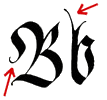
Rectangular and Square Pointed Nibs
 The rectangular pointed nib no. 505, manufactured by Brause & Co, Germany, was invented by the German calligrapher Karlgeorg Hoefer.
 One of its features is the twisted angle of 90 degrees that it produces, compared to a round hand lettering nib (see illustration). By rotating the rectangular plate to the edge when writing, a brush-like stroke is possible. Of course, this technique requires some practice.
Unfortunately, these nibs are no longer manufactured. From time to time I can offer some antique findings in the shop. If available, you will find them in the shop section ▪ "unusual nibs". If you are skilled, you may try to make one for yourself by grinding off the sides of a 4 or 5mm wide round nib (▪ Brause no. 500) with a diamond file. This variant is less flexible than the original no. 505, but the effort is still worthwhile.
A similar nib, the "Speedball A-Series" is being manufactured by Speedball Art Company in the US. These nibs have a square pointed nib. They are not as interesting (to me), but still worth trying.
▪ You can buy square pointed nibs here.
▪ An alphabet template written with the Brause no. 505 (pdf-document, 273 KB).
Music Writing Nibs
 The music writing nib usually is very flexible and has a double split tip to make possible extreme strokes widths variations. Originally, it was designed for drawing musical notes, but it also allows for very creative calligraphy scripts.
 Antique nibs are hard to find, but luckily there is a nib being manufactured again by William Mitchell (rights holder).
Music Ruling Nibs
 This nib is for the drawing of music lines, but may also be used for ornamental works to some extend. The German manufacturer Brause & Co still offers such a nib.
One of the characteristic features of the Copperplate Script is the contrast between the very thin hairlines and the strong, swelling curves of its letters. To achieve this contrast you need a very flexible nib with as fine a tip as possible.
 Often recommended are Joseph Gillotts no. 303, Brause & Co's no. 66 EF and nibs of type "Alfred". However there are many other nibs, which are very suitable. You will have to try different nibs to find your favourites.
▪ You can buy pinted nibs here.
▪ Use the search function of the calligraphy shop to look for the various options.
▪ You can buy a nib set with a selection of 6 fine and flexible nibs for Copperplate Script.
▪ You can buy a writing pad with special lining for Anglaise / Copperplate here.
Unlike writing instruments that do not react to pressure (e.g. pencils, ballpoint pens etc.) a flexible nib can help a child develop fine motoric skills. As soon as writing lessons in school are starting, pen nibs can contribute to more joy in writing. Smaller children love to use pen nibs for drawing. When a nib is broken, not much is lost.
 In general, ball pointed nibs and round nibs up to a width of 1.5mm are suitable for children, because these nibs are not as pointed and glide more easily over the paper than the pointed nibs. The less flexible and the broader the tip, the easier the pen nib can be handled. However it is the possibility of varying the stroke width, that makes the use of pen nibs so appealing.
Skilled children can also try all the other kinds of nibs at any time.
▪ You can buy a selection of easy to use pen nibs for children here.
When the nib is new, the ink beads on the smooth, metallic surface and thus cannot flow to the tip. Or more ink flows onto the paper than desired or a whole drop falls from the nib. The problem subsides after a while, when the metal surface oxidizes due to moisture and thus becomes rougher. The ink can be taken up evenly on the rougher surface. In some cases the nib may have been varnished or oiled by the manufacturer, which intensifies the problem.
Dip the nib into the ink and rub it gently but firmly with a paper towel. You can also use a drop of vinegar to oxidize the metal surface.
Scorching the nib, as is often recommended, can easily destroy the nib. The flame also causes oxidation of the metal surface, but it makes the metal lose its flexibility. The metal becomes soft and no longer springs back when pressure is applied. When the nib slit remains open just a tiny bit, the ink can no longer flow propperly to the tip. You can check whether the nib slit is completely closed by holding the nib against the light and seeing whether light shines through the gap.
In normal writing, the nib is both pulled and pushed. This is difficult with very fine and pointed nibs.
Ball pointed nibs and round nibs up to a width of 1mm are well suited. The less flexible the nib and the larger the tip, the easier it is to handle. You can also use round hand nibs up to a width of 1mm like the one shown below.

No, but there are different kinds of pen nibs, of which some are quite easy to use, while others require some practice. Your choice depends on the kind of script you would like to use. The properties of ball pointed nibs with little to no flexibility are similar to those of a fountain pen, and therefore, are relatively easy to handle. However they do not allow for stroke width variations and are therefore not interesting for calligraphic purposes.
Different inks have different qualities, regarding the possible fineness of the stroke, as well as the light-fastness. Standard inks will fade in weeks or months, when exposed to sunlight. Document-proof inks guarantee 100% lightfastness. These are usually iron gall inks, whose main components are gall nut and ferric sulfate. However, most standard inks are good for practice. By comparing different products, you will quickly note some differences.
The home made inks offered in the calligraphy shop have a very good light fastness and flow more easily from the pen than most standard inks. They are well suited for calligraphic art work and will retain their brightness, if they are not exposed to direct sunlight for longer time periods.
▪ You can buy a wide range of inks - with and without gloss pigment - here.
Inks are aqueous solutions of dyes. The dye, whether plant-based or synthetic, is therefore diluted in the water. Inks are highly fluid, remain water-soluble even after drying, and are more or less transparent, i.e. have little or no opacity. Lightfastness is usually poor, especially with plant-based inks and with standard inks made from aniline, fuchsine or eosin dyes. However, there are, very high-quality, durable, and unerasable inks. These are well suited for writing text on paper.
Indian inks are pigmented liquids. The pigments, e.g. soot particles from lampblack or from the oxygen-reduced combustion of selected woods, are insoluble in water and are kept in suspension by various binders, for example natural or synthetic resins. After some time, however, the pigments settle again and the ink must be shaken properly or stirred before use so to disperse the pigments in the liquid again.
In traditional Chinese and Japanese calligraphy, bar ink is used, which is rubbed with water on shale just before use. Indian ink, with the exception of Chinese bar ink, is usually more or less viscous and a little sticky, has a high opacity, good moisture resistance and is usually 100% lightfast, so it does not fade even when exposed to sunlight. Indian ink is very suitable for writing on plain leather or wood due to its high opacity. Of course, it can also be used on paper.
Advice: Leather can be degreased with alcohol or ox gall before writing, to prevent the writing fluid from beading. Wood must be very finely sanded before writing and rubbed very thinly with a highly diluted varnish or oil, to close the pores, so the ink does not bleed. If the varnish or oil is applied too thickly, you will have the opposite effect!
▪ You can buy high quality indian ink from the renowned manufacturer Rohrer & Klingner here.
The sizing of the paper prevents the ink from bleeding. The vast majority of papers for everyday use (writing pads, photocopying paper, etc.) only have a very thin superficial sizing, which is sufficient for most applications. However, when writing with ink and pen nibs, the superficial sizing is too weak, it dissolves due to the liquid, and then the ink bleeds. Apart from that, these papers are not very stable, do not allow corrections, and are not resistant to aging, which means that they will quickly turn yellow due to the excess acidity caused by production combined with exposure to light and dirt in the air.
Depending on the intended use, high-quality papers for artists' requirements have a ber sizing that penetrates the paper completely or partially. Aging resistance is given if the paper is specified as "acid-free". Good artists' papers also have an alkaline "buffer" against damaging, acidic environmental influences.
Special drawing papers and cardboards with 100 g per m² or heavier are very well suited for calligraphy. There is a huge range of different papers available in artists' supply stores, and it is difficult to choose: if the paper is too rough, writing with round hand nibs or pointed nibs becomes difficult or even impossible. If writing with a bamboo pen, a brush, cardboard pieces or other findings, however, new possibilities arise regarding the quality of the paper.
Experiment with different papers to find out which are most suitable for the different writing instruments and your personal techniques.
▪ You can buy good calligraphy papers and handmade papers here.
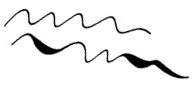
For ornamentation and squiggles you can use a pointed nib or a ball pointed nib. Ball pointed nibs with little flexibility are easier to handle at first than pointed nibs, because these can get stuck in the paper or scratch easily if you move them quickly. If you are experienced in "squiggling", the fine and flexible pointed nibs are very well suitable, because with these you can achieve very effective differences in stroke width.
Start with simple shapes like the ones shown below and find variations from there. Exercises with a pencil on a large sheet of paper are very helpful. Harmonious and well balanced patterns can only be achieved after quite a bit of practice!

▪ You can buy ball pointed nibs here.
▪ You can buy pointed nibs here.
▪ You can use the search function to look for nibs with certain grades of flexibility.
In general, yes. However, most left-handed people have become accustomed to a hand position that makes writing with pen nibs more difficult than it actually needs to be.
▪ See the chapter on left-handed writing for more information on this.
If the nib is not cleaned immediately after writing, it will crust over, start to rust, and soon become unusable. Cleaning with a dry paper towel is sufficient if you are writing with ink. If you are using indian ink, a moistened paper towel is better. Do not hold the nib under water, otherwise water will get into the holder and cause rust there.
If you want to write with round hand nibs, lettering styles with simple straight or rounded forms such as "Carolingian Minuscule", "Uncial", "Antiqua" or "Round Gothic" are recommendable. Lettering styles such as "Fraktur", "Kanzlei", "Schwabacher" and "Textur" are more difficult, because the nib often has to be edged and turned while writing.
If you would like to learn the Copperplate Script, it may not be an encouraging script to begin with. I personally would recommend to try for some time the straight forms of the Antiqua, until you are experiencend in the handling of pointed nibs.
▪ You can view different alphabet templates here.
▪ You can buy exercise books and other literature about calligraphy here.
This is a topic mostly interesting for calligraphers writing German texts, because the so-called "long s" - ⌠ - has only been used in the German-speaking area. The same is true for the so-called "sharp s" - ß -, which is a combination of long "⌠" and round "s".
Until some spelling reforms (ca. 1850), 2 types of lowercase "s" were in use: the long "⌠" and the round "s". Depending on the position of the "s" in the word, either one or the other was used. When writing old scripts (e.g. Fraktur, Schwabacher, Texture, Carolingian minuscule, etc.), the use of both "s" embellishes the typeface immensely and simply belongs to the scripts. In more modern scripts, it seems odd because we are no longer used to it. The two "s" are used according to the following rules:
The long "⌠" stands in the initial sound of a syllable, i.e. before the vowel, mutation, or diphthong. e.g. ⌠icher, ⌠ehen, lö⌠en, P⌠alm, Rät⌠el, Fern⌠ehen, etc. Note: ⌠ it also precedes a dropped voiceless "e", e.g. ich le⌠' (from: I le⌠e), Verwech⌠lung (from: Verwech⌠elung), Ba⌠ler Straße (from: Ba⌠eler Straße).
The round "s" (also called "final s") is placed in the final sound of a syllable, i.e. after the vowel, mutation or diphthong e.g.: Haus, Mesner, Kiosk, Cubism, Dresdner. Exceptions: Sound compounds sp and ss.
The "sharp s" (ß) is a combination of long "⌠" and round "s". It is often called "sz", but this is just a widespread misunderstanding. The "sharp s" (ß) is unfortunately also about to be eliminated / replaced by double-s. At least in calligraphy, I would keep it, just because of the nicer typeface.